In the post about 4 packaging design trends for 2019, we wrote about the use of nude color palettes. In this article, we will analyze more specifically what it is about, and then we will conclude by making some concrete examples of the use of nude palettes in packaging design.
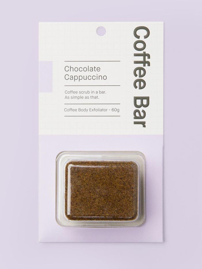
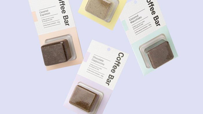
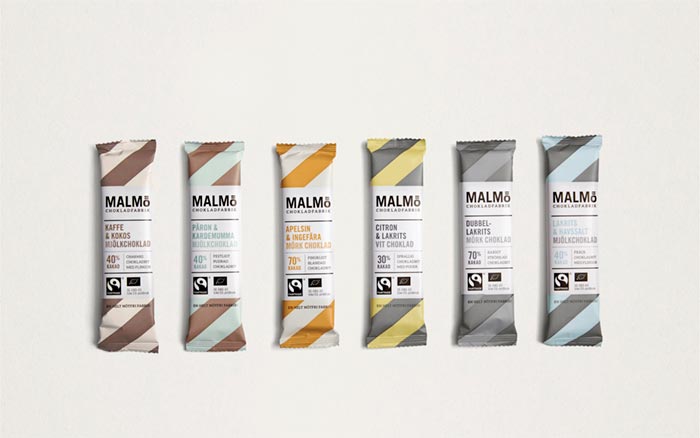
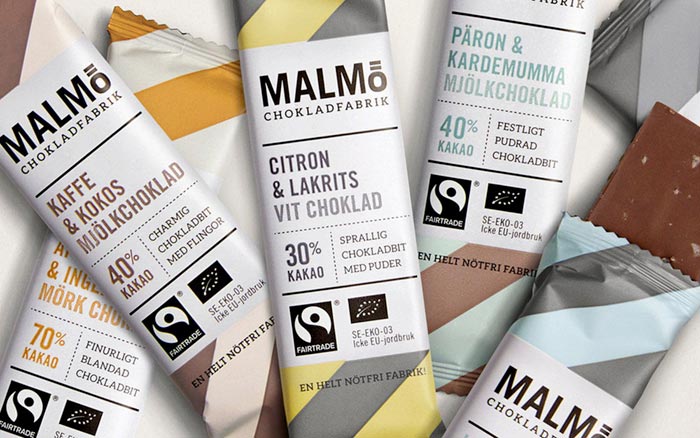
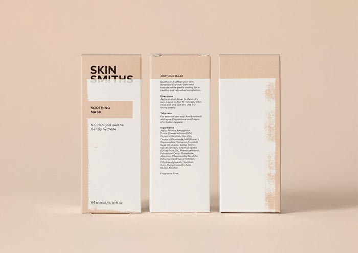
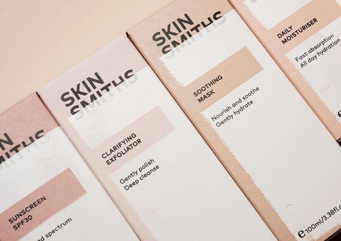
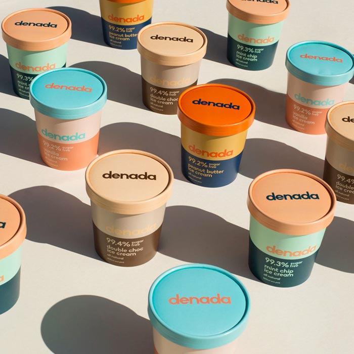
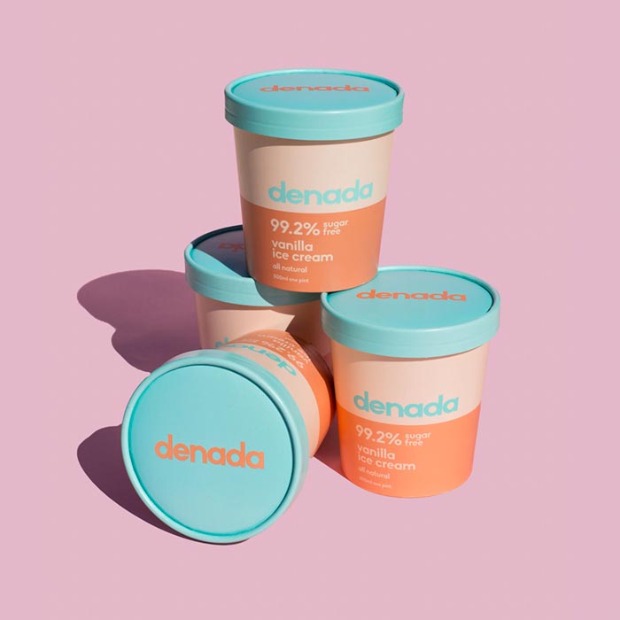
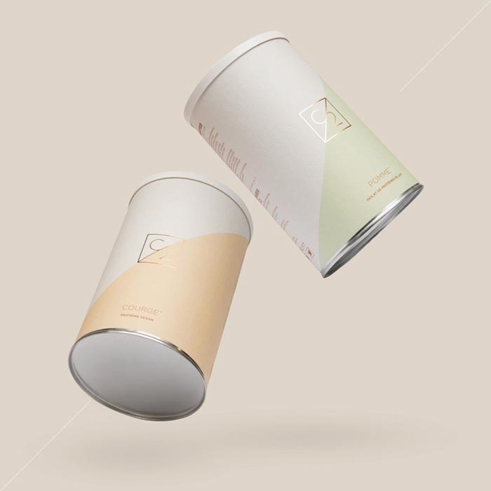
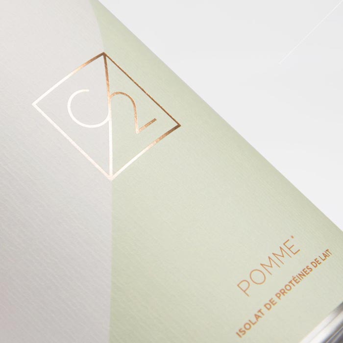
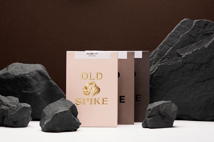
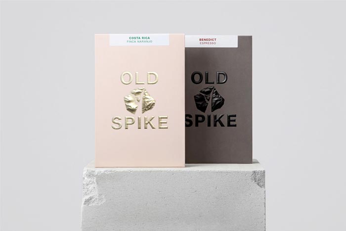
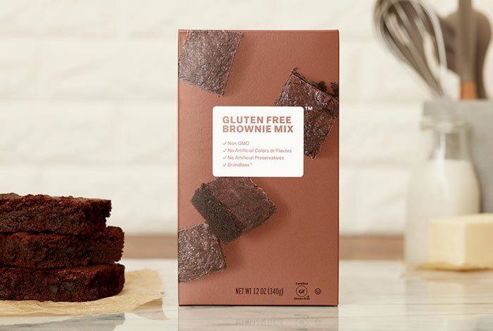
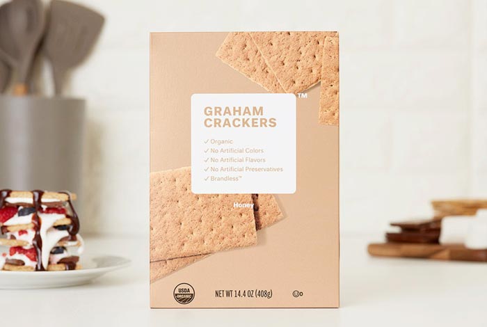
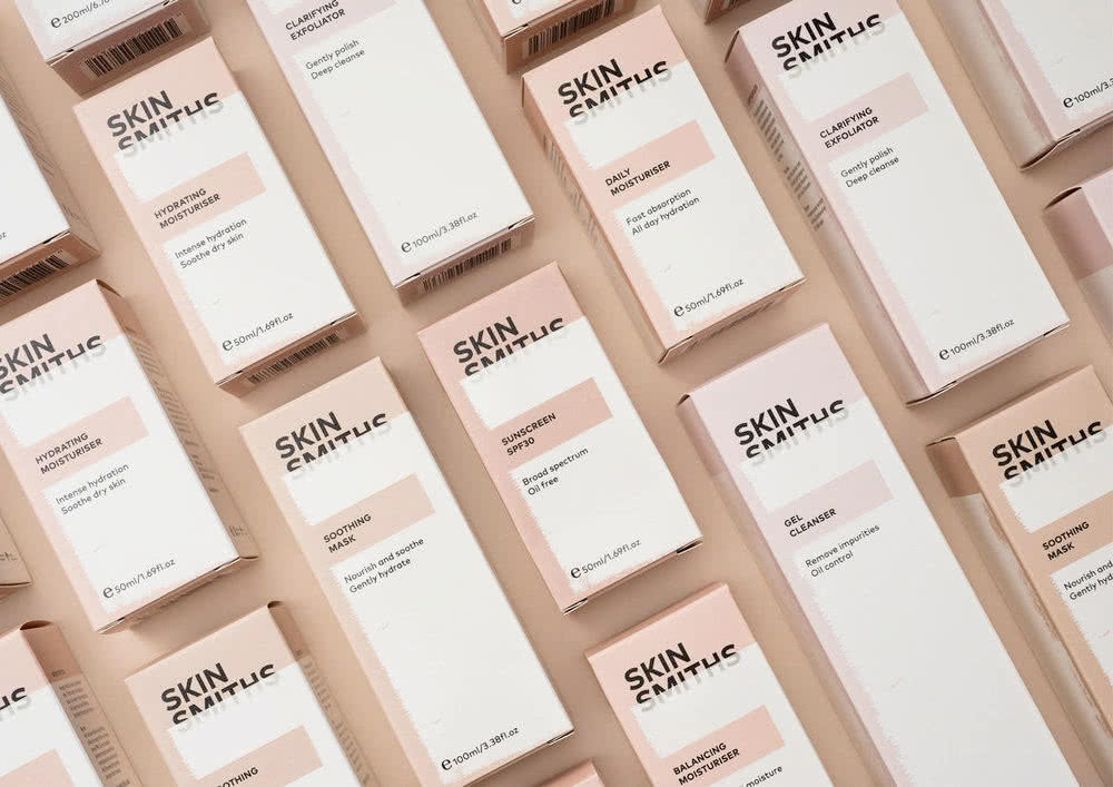
To begin with, we specify that the term nude does not refer to a particular color. It is a mix of peach, pink and ocher tones with cream and chocolate shades. This pastel color combination is really soft and relaxing, and it allows creating really interesting design results.
The charm of the soft shades of nude colors is fascinating many packaging designers, who are increasingly using this color range to create packagings with a natural and harmonious look able to shine in the shelves. Indeed, nude color combinations are a perfect way to stand out from the bright and colorful packagings that crowd the shelves. The proposed packages are a really good example of it.
Enjoy our gallery and tell us your opinion about this new packaging design trend for 2019.